
Blogs
How we built the Datadog heatmap to visualize distributions over time at arbitrary scale
Learn how we used DDSketch to enhance our heatmap visualizations, allowing us to represent and analyze high cardinality data distributions at scale.
 Trigger automation - MintlifyMintlify
 How we grew Mintlify by doing things that don't scaleMintlify
 Mintlify Alternatives: What to Consider (and Why There's No True Substitute)Mintlify
 Video: Building a Live Transcription Badge With Deepgram - Deepgram Blog ⚡️Deepgram
 5 Reasons to Keep Contributing to Open-Source Projects - Deepgram Blog ⚡️Deepgram
 Let’s Play Master and Servant: Real Time Synchronization Tool for Redis MigrationRedis
 How to implement AI training for employeesZapier
 Pancakes Are Delicious and Data Centers Are for Free StuffThenewstack
 Flockport: Time to Start All Over Again and Return to LXC ContainersThenewstack
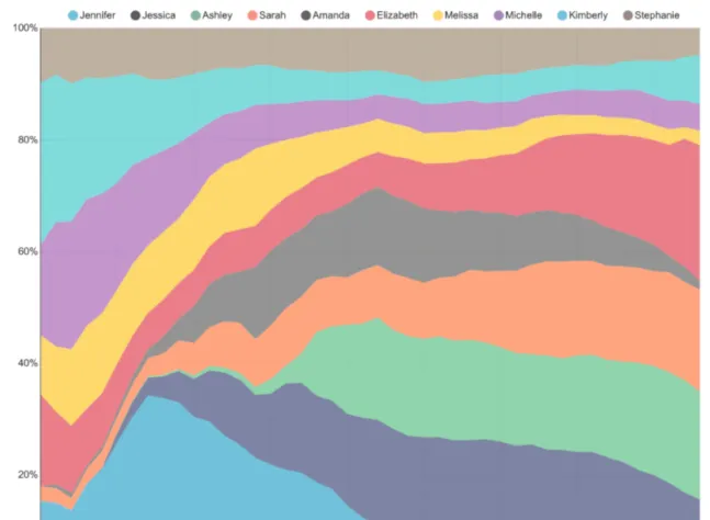 Explore and Visualize Data the Apache Superset WayThenewstack
 Transform and Future-Proof Your Architecture with MACHThenewstack
 Selecting the Right Database for Your MicroservicesThenewstack
 Announcing the New Pulumi Partner ProgramPulumi
 Discovered Stacks: One Place for All Your InfrastructurePulumi