
Metric graphs 101: Graphing anti-patterns
John Matson This is the third post in a series about visualizing monitoring data. In the first two parts of this series, we introduced you to several different visualization types—both timeseries graphs that have time as the x-axis, and summary graphs that provide a summary view of a time window.
 Errors are values - The Go Programming LanguageGo
Go Concurrency Patterns: Context - The Go Programming LanguageGo
Go Concurrency Patterns: Pipelines and cancellation - The Go Programming LanguageGo
Errors are values - The Go Programming LanguageGo
Go Concurrency Patterns: Context - The Go Programming LanguageGo
Go Concurrency Patterns: Pipelines and cancellation - The Go Programming LanguageGo
 Building a Remote MCP Server: OAuth, Tool Design & Lessons from 4,000+ AI Queries | MotherDuckMotherduck
 Creating an AI Summary App with Next.js | Vercel AcademyVercel
 Write effective prompts - MintlifyMintlify
 How We Created a Static Site That Generates Tartan Patterns in SVGCss Tricks
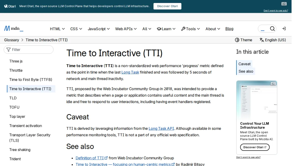 Time to Interactive (TTI) - GlossaryDeveloper Mozilla
 What is CX? Customer experience 101Zapier
 Deploy SurrealDB with Docker Desktop ExtensionDocker
 The ultimate guide to selling downloads with Zapier | ZapierZapier
 IBM, Red Hat Bring Load-Aware Resource Management to KubernetesThenewstack
 How to Give Your AI Agents Reliable App Access for FreeZapier
 Architecture as Code: KubernetesPulumi