
Metric graphs 101: Summary graphs
John Matson This is the second post in a series about visualizing monitoring data. In the first part of this series, we discussed timeseries graphs—visualizations that show infrastructure metrics evolving through time.
 Creating an AI Summary App with Next.js | Vercel AcademyVercel
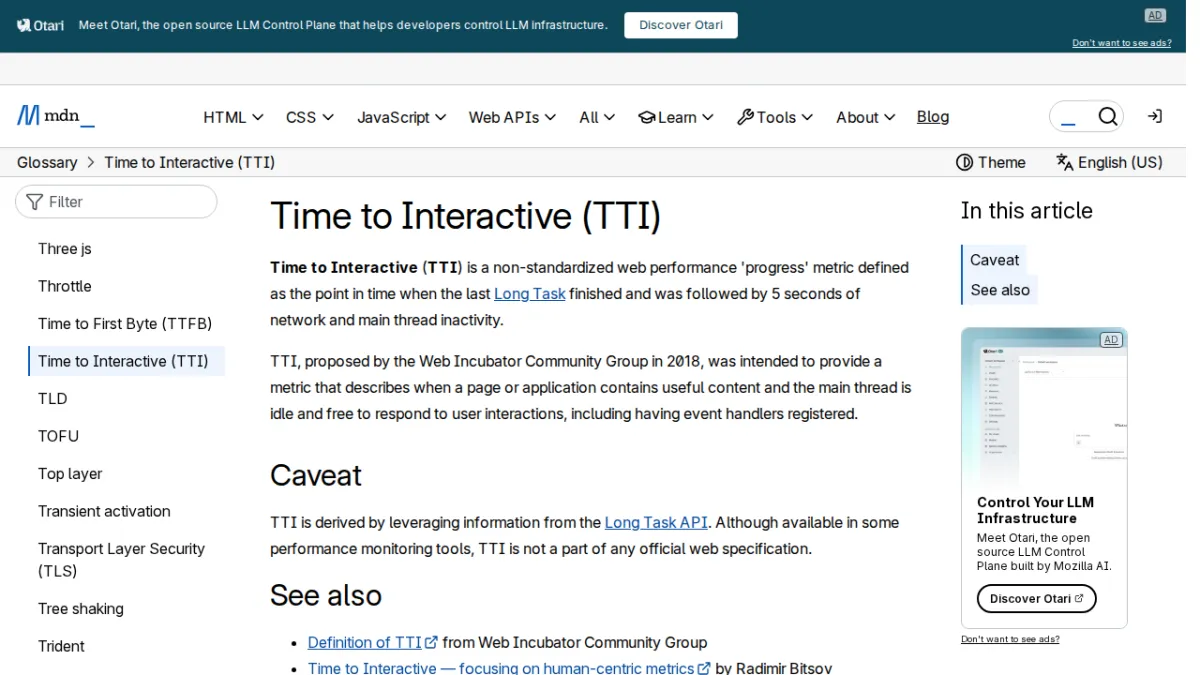 Time to Interactive (TTI) - GlossaryDeveloper Mozilla
 What is CX? Customer experience 101Zapier
 Deploy SurrealDB with Docker Desktop ExtensionDocker
 2021 at AssemblyAI - A Year in ReviewAssemblyai
 Optimize Cumulative Layout ShiftWeb
 Gatsby 101: See the Features, Benefits, and Trade-OffsNetlify
 Obfuscation 101: Unmasking the Tricks Behind Malicious CodeSocket
 Optimize Time to First ByteWeb
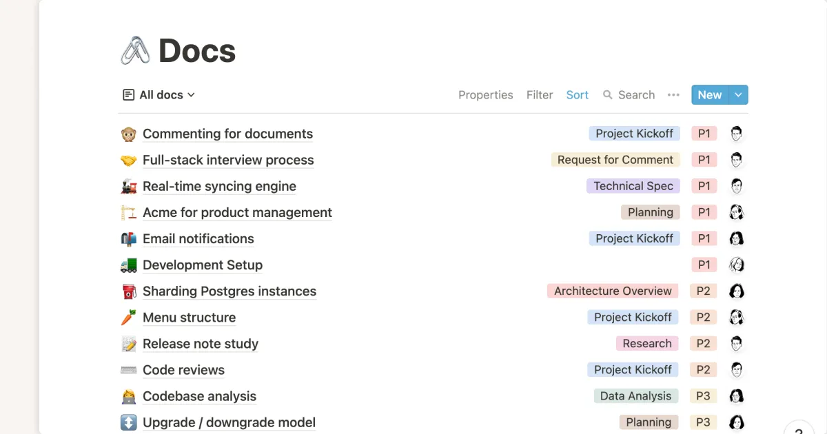 Knowledge management guide 101: benefits and importance for startupsNotion So
 MIT Machine Learning Uses 'Graph Grammar' to Automate and Optimize Robot DesignThenewstack
 DuckDB in Action - Chapter 5 - Exploring data without persistenceMotherduck
 How To Measure The Impact Of FeaturesSmashingmagazine
 2025 Docker State of App Dev: Key Insights RevealedDocker